


It’s always a challenge when you start the process of redesigning such an iconic brand, especially one that has an established presence on television and in an audience’s heart and minds. It’s even more challenging when you are dealing with ‘news’ content since there is already an expectation of a certain layout, presentation and tone to the site.
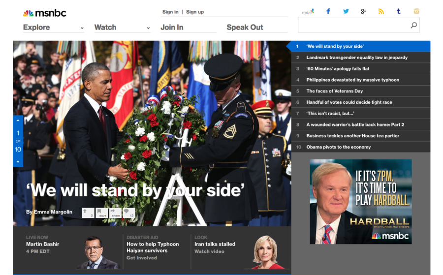
If you glance at the current landscape of news sites, it’s very similar and largely repeated themes, with countless thumbnails, many sections, a wide use of color and labels, and almost no visible hierarchy.
Audiences are bombarded with an overload of options and images. We saw this as an opportunity to create a design that calms the tension between these competing elements and establishes a curated news presentation for a progressive audience.
By stitching together visual and structural elements, we developed a platform for progressive discussion, presenting the most important stories to our passionate fans in an elegant and readable fashion.
We radically simplified the front-page experience, made the rest of the site more modular, reduced the top navigation’s complexity… and… updated from static headings to ‘actionable’ words promoting people to engage with the site in a totally new manner.
As part of this holistic presentation of the site, we felt that information graphics and data visualization were not just important to include as support but to bolster and inform the conversation as well. We adopted similar principles in how we created our distinctive look and feel to our editorial graphics; not only are they obviously clear, but socially accessible, as people really want to share these graphics with their networks.


In addition to these fundamental changes in the site presentation, we also recognized that not everyone consumes their news in one manner, so we adopted a mobile first/responsive design methodology to deliver the most flexible site experience, adapting to differences in browser screen sizes and devices.
Providing the maximum coverage possibilities for each story is crucial so the way in which we present our editorial content is core.
We adopted various best practices in how we present information on our article pages; including a large, high-quality image above the scroll to catch one’s eye when landing on the page, a bold headline, increasing the type size of the article contents, breaking up longer stories with media to allow someone to understand, consider and even respond via our enhanced commenting system (we’ve elevated comments and groups to sit at a similar level and focus as the article headline).
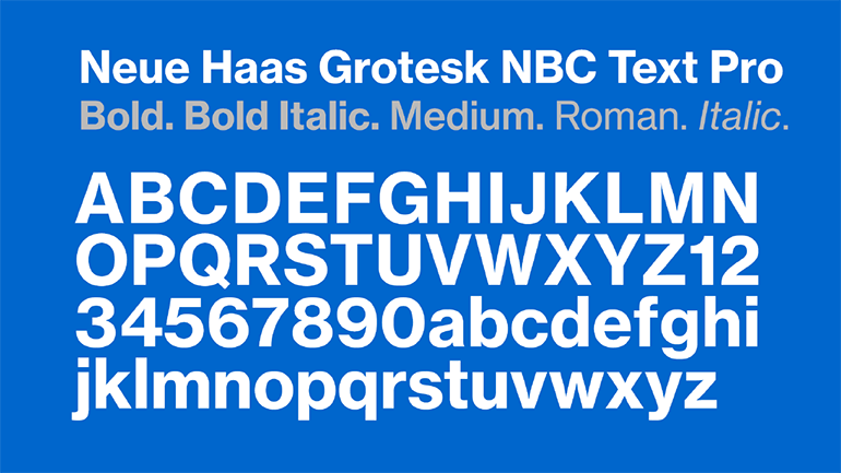
We selected a basic news color palette with fewer accent colors, we adopted a very clean yet timeless typeface Neue Haas Grotesk with its roots in Swiss typographic history, enabling headlines to stand out yet not be too shouty.
By integrating all of these elements aesthetically and visually we believe we’ve created a balance and hierarchy to the way in which all of our content is presented holistically across the site creating the most impactful news site experience to date.

The place for in-depth analysis, commentary and informed perspectives.